


Introduction
The media product i have created is a new drum and bass / electronic rock band called 'The Storm'; their debut music video release, and the ancillary album cover and website to promote them. Whilst constructing these texts, our group had to understand existing conventions of real media products and branding an artist; then make decisions whereas to use, develop or challenge these conventions in a way which worked beneficially to our overall project.
Our Music Video
This video explains some of the conventions we used in our media video.
This video explains some of the conventions we used in our media video.
This next video is part two, and explains how we developed and challenged some conventions in our music video.
Then short paragraph (or two) analysing video in accordance to a theorist.
Our Album Cover
Whilst our video is the main product, research needed to be done in to other album covers in order to understand the conventions, and decide whether to conform to them or not, especially for albums of the same genre.
Whilst our video is the main product, research needed to be done in to other album covers in order to understand the conventions, and decide whether to conform to them or not, especially for albums of the same genre.
Early on we decided that we wanted our album cover to be fairly dark and minimalistic; as a debut cover we believed it would be very intriguing and fits with the electronic sound of the song. Before designing our actual cover we needed to design a logo for our band name. After looking at several other drum and bass / dubstep logo's, we decided that the futuristic and thick fonts looked really effective, and it would be necessary to produce something similar as a genre signifier for our band and album cover.


 |
| Our logo in comparison to some other existing ones |
Many drum and bass and electronic albums feature a very minimalistic front cover, with their logo being the focus. We really liked this approach, with their being no images of the band themselves on the front cover; it separates the genre from many others and can be very effective. You can see here some other album covers and how our video has followed some of the conventions used by them.


Our album cover uses the convention of the name of the band being the central focus of the cover. It also is a self-titled album, which is common of debut releases and even more common in the world of electronic music. A simple colour scheme and glowing lighting effects are quite common also and combined with the smoke has connotations of a live gig environment, or something otherworldly.
We also used our symbol on the front cover; it is quite subtle but noticeable through the smoke. This develops conventions as we wanted to use this symbol throughout all texts, and not many album covers of this genre use an associated band or artist symbol, most just use the name logo of the band.


The back of our cover is quite conventional, though it also develops the same convention as the inside sleeve; building a stronger personal relationship with the band members than a blank back cover. Our back cover keeps in with the simple black and white colour scheme, but uses silhouettes of the band members around the track listing.
We did follow the convention of a minimalistic back cover though, as we believed (for our whole album cover) that clutter would distract, and less content can work very intriguingly for an audience; we think using the darkness on the back page juxtaposed with the light outline on the silhouettes works really well to entice an audience member.
The track listing is simple, a white font, and the same as our logo. This convention was followed by the Chase and Status album on the left, but not by the Daft Punk or Pendulum albums on the right.
Some necessary conventions needed to be conformed to in order to make our product look professional: a barcode is on every album cover, as is institutional information such as the record label, copyright, date of publishing and website address. We have included all of those things, and we designed our own logo for a record label who we used with 'The Storm'.
We also used our symbol on the front cover; it is quite subtle but noticeable through the smoke. This develops conventions as we wanted to use this symbol throughout all texts, and not many album covers of this genre use an associated band or artist symbol, most just use the name logo of the band.

We also developed conventions with our inside sleeve to our cover (above). A lot of DJ's and bands within the drum and bass genre remain mostly unseen on their album covers, but we want our audience to draw a strong connection with the members of the band themselves; the members of 'The Storm' play their own instruments and it is very important that they establish themselves as a proper band. Our lead singer has the most space in the sleeve, as he would become the frontman of our band- distinguishing between faceless DJ's who simply use decks and a band who play live is very important to us and we believe this can be achieved by introducing the band to the audience across all platforms of our product.


The back of our cover is quite conventional, though it also develops the same convention as the inside sleeve; building a stronger personal relationship with the band members than a blank back cover. Our back cover keeps in with the simple black and white colour scheme, but uses silhouettes of the band members around the track listing.
We did follow the convention of a minimalistic back cover though, as we believed (for our whole album cover) that clutter would distract, and less content can work very intriguingly for an audience; we think using the darkness on the back page juxtaposed with the light outline on the silhouettes works really well to entice an audience member.
The track listing is simple, a white font, and the same as our logo. This convention was followed by the Chase and Status album on the left, but not by the Daft Punk or Pendulum albums on the right.
Some necessary conventions needed to be conformed to in order to make our product look professional: a barcode is on every album cover, as is institutional information such as the record label, copyright, date of publishing and website address. We have included all of those things, and we designed our own logo for a record label who we used with 'The Storm'.
 |
| Pulse Records, our fictional record label |
In terms of number of tracks, there is not many conventions which define a set number of tracks, based on genre, artist or anything else. The fact it is a debut album does make a difference; a band will normally not have as many tracks on a first album as they introduce themselves to the business: 'The Storm' are brand new to the drum and bass scene and we think would produce a shorter record with a more focused direction, as they need to establish a clear name for themselves early on before branching out in other directions.
This is also why we chose to break the convention of having some collaboration tracks. Due to the nature of drum and bass / dubstep / electronic music, remixes are extremely common and so are featuring artists across many tracks of an album. However, as a debut album we think it is important to completely establish your own musical sound before joining creatively with others; in that respect we broke conventions by having a drum and bass album which is entirely our own.
Our Website

This is the main page of our website.
It follows many common conventions of other artist websites- a website is less about creative expression (like the video), and is more about making a user friendly and highly interactive experience for the user; so conforming to conventions of real websites was a definite must. It also must demonstrate consistency of branding, such as logo's being reused and colour schemes.
Here are some other drum and bass or electronic artist's websites:


A common convention we followed is to have a static top portion of the web page which displays important information and branding devices, such as our main logo in the top left and a link to buy the album in the centre. To the left we see our symbol, behind a small mp3 button which automatically plays the single as you enter the website. At the bottom we have links to the bands YouTube, Facebook, Twitter and RSS feeds which remain permanently on display.
We also followed our convention to have our logo very prominent, and always on display at the top of the page.
To have sections of the page which do not change is common as it allows for easy navigation and a constant option for the consumer to buy the product and view other important pages.
We also followed the convention to have a navigation bar as it makes moving about the website very easy. Other websites have the same thing; and often the page names are similar- all of the above websites have a news / updates / home page, a live / tour / shows page, a video page, and 2 of the 3 have a shop.
Sticking to conventions on our website was important if we wanted to make it look professional and successful.
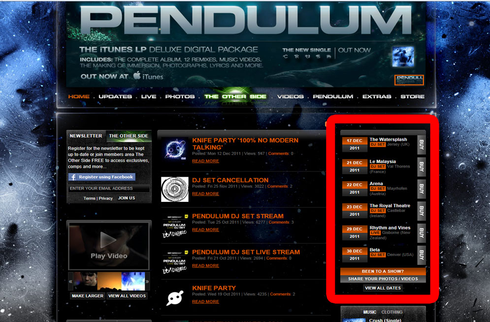

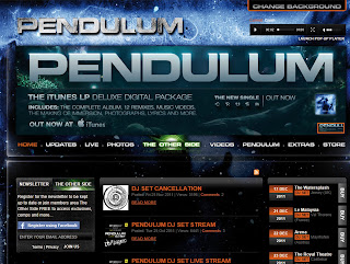
We also conformed to the notion of the focusing on our live shows like many other drum and bass bands; such as Pendulum themselves, and we decided to include a feature on our front page which lists the nearest gigs.
We challenged conventions by having biographies of our band members and a competition page, which is less common.
No comments:
Post a Comment