Thank you for taking the time to read my individual and group blogs. You will find my finished video, album cover and website at the top of the blog, and are also available on our group blog.
To the right are all the appropriate links: our teachers blogs, my other group members blogs and some of my inspirations online. I have also labeled every post dependant on which section of the project it is relevant to.
All my research findings are posted here, as well as many individual reflections to our production process. Much of our work has been compiled on the group blog, so please read everything to get the full picture!
- Robbie Lardi, Candidate Number 3400

Official Website

Official Website
Album Cover

Album Cover
Friday, 16 December 2011
This blog is now CLOSED!
This blog is now officially closed!
In all my years here at Latymer, i have never worked on something which has been as much fun as this, and i am so so proud of how it has worked out- i think our video is great and i will truly miss all the lovely people and teachers who made it all come together.
Media really is a family: what an amazing few months, and everyone should be so proud of what we've all achieved.
Wednesday, 14 December 2011
Evaluation Question 1
1. IN WHAT WAYS DOES YOUR MEDIA PRODUCT USE, DEVELOP OR CHALLENGE FORMS AND CONVENTIONS OF REAL MEDIA PRODUCTS
This next video is part two, and explains how we developed and challenged some conventions in our music video.


The font also is quite futuristic and sci-fi, which is quite a common convention of drum and bass or Dubstep artists, and complements the electronic nature of the song.
Many drum and bass and electronic albums feature a very minimalistic front cover, with their logo being the focus. We really liked this approach, with their being no images of the band themselves on the front cover; it separates the genre from many others and can be very effective. You can see here some other album covers and how our video has followed some of the conventions used by them.


We also followed our convention to have our logo very prominent, and always on display at the top of the page.

Introduction
The media product i have created is a new drum and bass / electronic rock band called 'The Storm'; their debut music video release, and the ancillary album cover and website to promote them. Whilst constructing these texts, our group had to understand existing conventions of real media products and branding an artist; then make decisions whereas to use, develop or challenge these conventions in a way which worked beneficially to our overall project.
Our Music Video
This video explains some of the conventions we used in our media video.
This video explains some of the conventions we used in our media video.
This next video is part two, and explains how we developed and challenged some conventions in our music video.
Then short paragraph (or two) analysing video in accordance to a theorist.
Our Album Cover
Whilst our video is the main product, research needed to be done in to other album covers in order to understand the conventions, and decide whether to conform to them or not, especially for albums of the same genre.
Whilst our video is the main product, research needed to be done in to other album covers in order to understand the conventions, and decide whether to conform to them or not, especially for albums of the same genre.
Early on we decided that we wanted our album cover to be fairly dark and minimalistic; as a debut cover we believed it would be very intriguing and fits with the electronic sound of the song. Before designing our actual cover we needed to design a logo for our band name. After looking at several other drum and bass / dubstep logo's, we decided that the futuristic and thick fonts looked really effective, and it would be necessary to produce something similar as a genre signifier for our band and album cover.


 |
| Our logo in comparison to some other existing ones |
Many drum and bass and electronic albums feature a very minimalistic front cover, with their logo being the focus. We really liked this approach, with their being no images of the band themselves on the front cover; it separates the genre from many others and can be very effective. You can see here some other album covers and how our video has followed some of the conventions used by them.


Our album cover uses the convention of the name of the band being the central focus of the cover. It also is a self-titled album, which is common of debut releases and even more common in the world of electronic music. A simple colour scheme and glowing lighting effects are quite common also and combined with the smoke has connotations of a live gig environment, or something otherworldly.
We also used our symbol on the front cover; it is quite subtle but noticeable through the smoke. This develops conventions as we wanted to use this symbol throughout all texts, and not many album covers of this genre use an associated band or artist symbol, most just use the name logo of the band.


The back of our cover is quite conventional, though it also develops the same convention as the inside sleeve; building a stronger personal relationship with the band members than a blank back cover. Our back cover keeps in with the simple black and white colour scheme, but uses silhouettes of the band members around the track listing.
We did follow the convention of a minimalistic back cover though, as we believed (for our whole album cover) that clutter would distract, and less content can work very intriguingly for an audience; we think using the darkness on the back page juxtaposed with the light outline on the silhouettes works really well to entice an audience member.
The track listing is simple, a white font, and the same as our logo. This convention was followed by the Chase and Status album on the left, but not by the Daft Punk or Pendulum albums on the right.
Some necessary conventions needed to be conformed to in order to make our product look professional: a barcode is on every album cover, as is institutional information such as the record label, copyright, date of publishing and website address. We have included all of those things, and we designed our own logo for a record label who we used with 'The Storm'.
We also used our symbol on the front cover; it is quite subtle but noticeable through the smoke. This develops conventions as we wanted to use this symbol throughout all texts, and not many album covers of this genre use an associated band or artist symbol, most just use the name logo of the band.

We also developed conventions with our inside sleeve to our cover (above). A lot of DJ's and bands within the drum and bass genre remain mostly unseen on their album covers, but we want our audience to draw a strong connection with the members of the band themselves; the members of 'The Storm' play their own instruments and it is very important that they establish themselves as a proper band. Our lead singer has the most space in the sleeve, as he would become the frontman of our band- distinguishing between faceless DJ's who simply use decks and a band who play live is very important to us and we believe this can be achieved by introducing the band to the audience across all platforms of our product.


The back of our cover is quite conventional, though it also develops the same convention as the inside sleeve; building a stronger personal relationship with the band members than a blank back cover. Our back cover keeps in with the simple black and white colour scheme, but uses silhouettes of the band members around the track listing.
We did follow the convention of a minimalistic back cover though, as we believed (for our whole album cover) that clutter would distract, and less content can work very intriguingly for an audience; we think using the darkness on the back page juxtaposed with the light outline on the silhouettes works really well to entice an audience member.
The track listing is simple, a white font, and the same as our logo. This convention was followed by the Chase and Status album on the left, but not by the Daft Punk or Pendulum albums on the right.
Some necessary conventions needed to be conformed to in order to make our product look professional: a barcode is on every album cover, as is institutional information such as the record label, copyright, date of publishing and website address. We have included all of those things, and we designed our own logo for a record label who we used with 'The Storm'.
 |
| Pulse Records, our fictional record label |
In terms of number of tracks, there is not many conventions which define a set number of tracks, based on genre, artist or anything else. The fact it is a debut album does make a difference; a band will normally not have as many tracks on a first album as they introduce themselves to the business: 'The Storm' are brand new to the drum and bass scene and we think would produce a shorter record with a more focused direction, as they need to establish a clear name for themselves early on before branching out in other directions.
This is also why we chose to break the convention of having some collaboration tracks. Due to the nature of drum and bass / dubstep / electronic music, remixes are extremely common and so are featuring artists across many tracks of an album. However, as a debut album we think it is important to completely establish your own musical sound before joining creatively with others; in that respect we broke conventions by having a drum and bass album which is entirely our own.
Our Website

This is the main page of our website.
It follows many common conventions of other artist websites- a website is less about creative expression (like the video), and is more about making a user friendly and highly interactive experience for the user; so conforming to conventions of real websites was a definite must. It also must demonstrate consistency of branding, such as logo's being reused and colour schemes.
Here are some other drum and bass or electronic artist's websites:


A common convention we followed is to have a static top portion of the web page which displays important information and branding devices, such as our main logo in the top left and a link to buy the album in the centre. To the left we see our symbol, behind a small mp3 button which automatically plays the single as you enter the website. At the bottom we have links to the bands YouTube, Facebook, Twitter and RSS feeds which remain permanently on display.
We also followed our convention to have our logo very prominent, and always on display at the top of the page.
To have sections of the page which do not change is common as it allows for easy navigation and a constant option for the consumer to buy the product and view other important pages.
We also followed the convention to have a navigation bar as it makes moving about the website very easy. Other websites have the same thing; and often the page names are similar- all of the above websites have a news / updates / home page, a live / tour / shows page, a video page, and 2 of the 3 have a shop.
Sticking to conventions on our website was important if we wanted to make it look professional and successful.
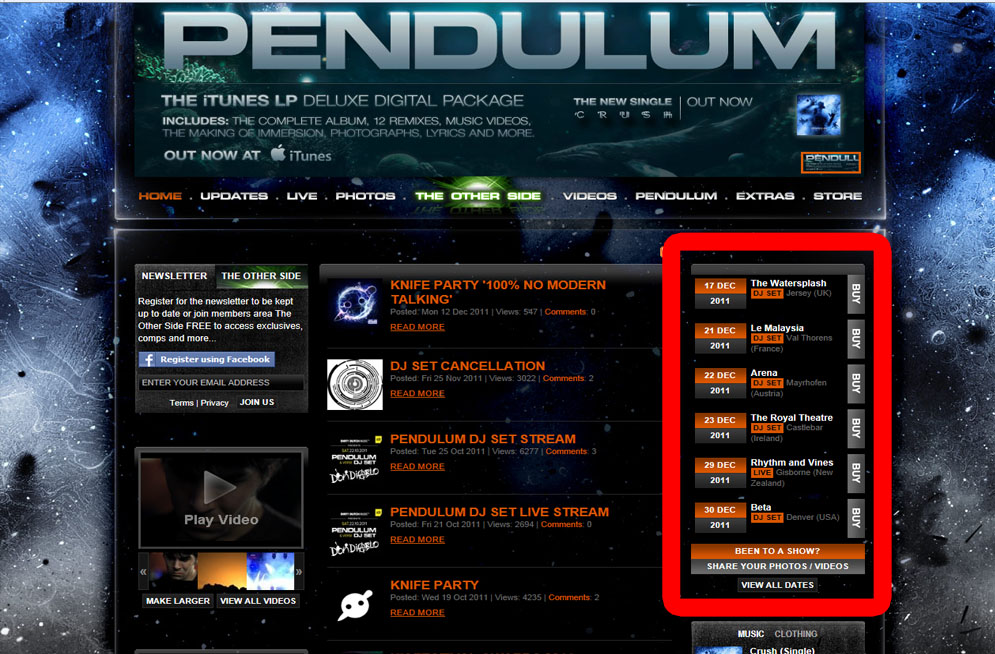

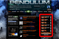
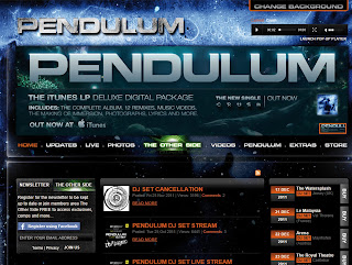
We also conformed to the notion of the focusing on our live shows like many other drum and bass bands; such as Pendulum themselves, and we decided to include a feature on our front page which lists the nearest gigs.
We challenged conventions by having biographies of our band members and a competition page, which is less common.
Evaluation Question 2
2. HOW EFFECTIVE IS THE COMBINATION OF YOUR MAIN PRODUCT AND ANCILLARY TEXTS?
Our main product was our music video itself, but we also constructed an album cover for our artists debut album, along with a website promoting the new band.
Whilst designing our video, album cover and website, we made sure there were high levels of synergy and consistency in regards to our branding. This had to be maintained across all platforms, as is extremely important for a debut artist to build a strong identity as they are selling themselves to the industry.
A constant colour scheme is used throughout our products; mostly black, with some cold blues and white used in contrast. Our Wix website is all black, with white text and blue highlights. Our album cover is all black, with blue smoke; a graphic which is also used on our website. We also colour graded the video using Colour (a piece of software on the Macintosh), to give the narrative sections a cold, blueish tint to them, and to make the performance sections seem dark and moody.
The first decision we made was to anchor our band to a symbol; something simple and instantly recognisable. Being a huge Red Hot Chili Peppers fan, i was aware of how a symbol can stick firmly in your memory, and we wanted to use it across all platforms as a motif for ourselves. The decision to make a symbol was made before we had even picked our band name!
The symbol was then used on the front of our album cover, and we spray painted it on to our backdrop for the performance in our video.
The logo in our video:


We designed the products with very consistent branding throughout. The website is the hub of our marketing campaign; it offers the greatest deal of contact and interactivity with the band and as such is crucial to launching an artist.
The aim is to make accessibility as easy and integrated as possible, the end goal being for the consumer to purchase our track and / or video.

You can see on our website here how we have integrated our products together. The menu buttons and all content above them stay in place permanently; so the consumer always has the option to purchase the debut album, by clicking on the link and being redirected to the iTunes store.
The band logo is also always visible, as well as the triangular symbol in the top right; both of which make up our album cover. On the main page of the website you can look at the album cover too; the insides and back as well. The website is simply a tool to help consumers invest in a band through interactivity, and we decided a permanent link to purchase the album was necessary.
As you enter the website, our track plays automatically, and there is a tab which lets you view the finished video. There is also a link to YouTube in the bottom right of the page which takes you to our video. We also wore the same costume for our promotional shoot as we did for the video; some cross platform marketing, this would become the image and dress style of our band.

The website generally offers a level of interactivity which would hopefully increase audience engagement and interest with the band. You can check tour dates, get updated with the latest news about the band, view through a load of pictures in the gallery, and read biographies for each member. We also made a Facebook and Twitter page for our band; as our target audience is young men, and over 90% of 16-24 olds use social networking sites, we wanted to broaden our reach and appeal to suit their needs, integrating it all together through the website.

There is also a page to leave comments for the band, you can sign up to our mailing list to receive updates, and there is a competition which involves 'The Storm' playing a secret gig at an undisclosed location; tickets are free and only released for about an hour.
We created a shop with an array of merchandise available for the consumer on the website. This works well for the brand as the T-shirts and hoodies feature our logo, and it allows fans to own an exclusive piece of clothing available nowhere else. You can also purchase guitar picks and a customised guitar; tying in with our quite musical fanbase.


Finally, we decided to create a symbiotic relationship with another groups band: INFLUX. We created a poster advertising a one night only collaboration event between the two, and put a link to their website on ours, and vice versa. This type of relationship is mutually beneficial and would be commercially viable as the genres are not too dissimilar from one another.
Our main product was our music video itself, but we also constructed an album cover for our artists debut album, along with a website promoting the new band.
Whilst designing our video, album cover and website, we made sure there were high levels of synergy and consistency in regards to our branding. This had to be maintained across all platforms, as is extremely important for a debut artist to build a strong identity as they are selling themselves to the industry.
A constant colour scheme is used throughout our products; mostly black, with some cold blues and white used in contrast. Our Wix website is all black, with white text and blue highlights. Our album cover is all black, with blue smoke; a graphic which is also used on our website. We also colour graded the video using Colour (a piece of software on the Macintosh), to give the narrative sections a cold, blueish tint to them, and to make the performance sections seem dark and moody.
 |
| An example of our colour scheme on our website |
.jpg) |
| The Red Hot Chili Peppers Symbol |
 |
| Our Logo, used throughout our products |
The symbol was then used on the front of our album cover, and we spray painted it on to our backdrop for the performance in our video.
The logo in our video:

 |
| The Logo on our website |

We designed the products with very consistent branding throughout. The website is the hub of our marketing campaign; it offers the greatest deal of contact and interactivity with the band and as such is crucial to launching an artist.
The aim is to make accessibility as easy and integrated as possible, the end goal being for the consumer to purchase our track and / or video.

You can see on our website here how we have integrated our products together. The menu buttons and all content above them stay in place permanently; so the consumer always has the option to purchase the debut album, by clicking on the link and being redirected to the iTunes store.
The band logo is also always visible, as well as the triangular symbol in the top right; both of which make up our album cover. On the main page of the website you can look at the album cover too; the insides and back as well. The website is simply a tool to help consumers invest in a band through interactivity, and we decided a permanent link to purchase the album was necessary.
As you enter the website, our track plays automatically, and there is a tab which lets you view the finished video. There is also a link to YouTube in the bottom right of the page which takes you to our video. We also wore the same costume for our promotional shoot as we did for the video; some cross platform marketing, this would become the image and dress style of our band.

 |
| The same costumes again used in our album cover |
There is also a page to leave comments for the band, you can sign up to our mailing list to receive updates, and there is a competition which involves 'The Storm' playing a secret gig at an undisclosed location; tickets are free and only released for about an hour.
We created a shop with an array of merchandise available for the consumer on the website. This works well for the brand as the T-shirts and hoodies feature our logo, and it allows fans to own an exclusive piece of clothing available nowhere else. You can also purchase guitar picks and a customised guitar; tying in with our quite musical fanbase.


Finally, we decided to create a symbiotic relationship with another groups band: INFLUX. We created a poster advertising a one night only collaboration event between the two, and put a link to their website on ours, and vice versa. This type of relationship is mutually beneficial and would be commercially viable as the genres are not too dissimilar from one another.
Tuesday, 13 December 2011
Evaluation Question 3
Question 3: What have you learnt from your audience feedback?

Scan_0004
Scan_0006
Conclusion:
 |
| A mood boarch encapsulates the lives of our target audience. |
A typical fan of 'The Storm'
Name: Max Gray
Age: 19
Recent gigs attended: Reading Festival, Outlook Festival, a multitude of smaller raves and club nights
Current employment: Sheffield University, second year of Media Studies.
Hobbies: Plays guitar in band with his flatmates, makes drum and bass music on his computer, spends all his money on gigs, skateboards, drug taking, getting drunk
Perfect friday night: A drum and bass secret gig, a bottle of vodka and some ecstasy. Aims to pick up girls; loves the cathartic release of live performances.
Favourite bands: Pendulum, The Prodigy, Chase and Status, Daft Punk, Sub Focus, Flux Pavilion
Favourite Films: Taken, Fight Club, Inception, Donnie Darko
TV Shows: Supernatural, Family Guy, Spooks
Other traits: single, loud, underachiever, unorganized, rebellious, messy, friendly
We decided the most useful audience feedback we could recieve would be from a range of people, and the video above summarizes some of our responses.
We were really pleased with the responses; people within the target audience of young men seemed to be really pleased with the end result; and yet it's appeal was not so limited that other ages and genders didn't also love it.
Particular mentions were the quick editing, the strong narrative, the strong performance, and particularly the neon light section at the end of our video. We think this section was very well recieved as it appeals our target audience of ravers and party goers; the neon paint is representative of a live show. Our video has yet to recieve a lower score than 8 / 10, which is highly encouraging; and we have had a fantastic response from everyone who has seen it. From this feedback (lots of it from within our target audience) we have learnt the importance of tailoring your product to suit the target audiences needs; we did this through creating a strong brand image.
Some negative points include that our middle section sags slightly, as we reuse the idea of my character running, being cornered, then escaping once more about three times in a row. Other critisisms include a lack of performance shots in the opening of the video, and a lack of performance in the UV light set up at the end of the video.

We also decided that we needed some audience feedback in repsonse to our intial edit, in order to then re-edit and make it as good as possible. One negative point that we recieved which i totally agree with is the rushed ending; the lack of UV performance and the very sudden twist in the narrative in between the fighting and the kiss. This was because we had to trim the original track from a hefty 4 minutes 30 down to 3 minutes. Whilst my original idea accomadated for a full length final chorus, we had to cut it in half which meant that our ending had to be quite rushed: as we did not want to reveal the UV light any earlier than the final chorus, and we also had to tie up the narrative very quickly.
To make the ending slightly more interesting, and to wrap up the narrative successfully, we included a short flashing montage whilst my character kisses Eva which we believed was a more powerful conclusion to the whole video.
Here are a couple of the audience feedback sheets we recieved after screening our first edit to a focus group of people:
Scan_0004
Scan_0006
Conclusion:
Audience feedback and responses is crucial to making a successful video. We needed to understand our target audience before attempting to make a video for them. We made this quite easy for ourselves by picking a track for which we are a part of the target audience, so essentially we were making a video which we ourselves would love; i think this is why we became so invested in making our video as amazing as possible.
We have also learned that whilst accomodating to a primary target audience you can inadvertently please many other demographics; girls who have seen our video seem to like it just as much as boys- it is more the genre of music which is favoured by different genders instead of the video itself.
Monday, 12 December 2011
Evaluation Question 4
Question 4 - How did you use new media technologies in the construction, research and planning and evaluation stages?
New media technologies completely enveloped our project; very little of what we managed to achieve could have been made possible without the use of new technologies and advancements in Web 2.0.
Research and Planning
WEB 2.0
Before even proposing and song and video idea, we needed to gather information and inspiration from the huge array of videos now available online, through services such as YouTube and GoogleVideo.


For construction, we have made a Facebook page for our band, which we then linked to our band website.
Construction
Equipment
Using new HD cameras was very beneficial to our project as we got to produce a film in fantastic quality; the camera's also allowed us to successfully capture our scenes with the UV lighting, which would have been near impossible with an inferior camera.
In terms of lighting, we used a set of 3 650 Watt Redhead lights for our performance shoots and nothing for our narrative shooting.
 Adobe CS5 Package
Premier Pro
This was the software we used to edit together our footage. It has been hugely useful to our project and has allowed to edit with complete precision.
It also let us do some clever effects with Eva, such as the shots where she dissapears.
Here is a screencap from Premier Pro:
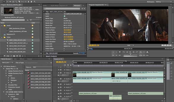
We used Premier Pro to edit our track. The brief stated that our video must be 3 minutes or less, and our track selection was 4 minutes 30 seconds; even though Premier Pro is primarily for editing video, it worked brilliantly for cutting down and marginally speeding up our track, so it was under 3 minutes long.
We also used Premier Pro to create a promo montage-style video for the screening of all our music videos.
Photoshop
Photoshop was used heavily throughout the construction of our video, website and album cover. The album cover template itself was presented to us in a photoshop (.psd) format, making it the essential software to use for stills editing and graphics.
We created our main band logo on Photoshop:

After making this logo the blue and black colour scheme became consistent to our branding; as did the font of our name. The smokey effect round the letters was achieved through Photoshop and was also a motif we used across our album cover and website.
See here our album cover, which was entirely constructed in Photoshop.

We used Photoshop to edit promo pictures of the band, which were then used on our album cover and website. It helped us change the tints of pictures and put effects on them which suited our cold and metallic colour scheme.


We used Photoshop to create a poster for an event with our band and another groups band together. We thought this was a good example of synergy, and could be made possible by Photoshop.

COLOUR
Colour was the software on the Mac which we used to colour grade our video.
Here is a short video, narrated by Eoin, which explains some of it's uses and applications with regards to our footage.
WEB 2.0
WIX.COM
Wix.com was the website we used to make our website. It is a flash based online website designer. We were the first year in our school to get to use this software, and it proved to be a fantastic way to integrate our website in with the rest of our project.
You can embed videos, pictures, hyperlinks and sound files in to your website through Wix, and it allows for high levels of visual customisation, with many buttons, effects and features available.
It allowed us to embed our music video on the 'Video' page of our website, as well as have our track selection playing when the user first arrives on the website.
The level of customisation available also allowed us to keep our branding consistent throughout all our texts. Starting with the original black and blue scheme on our album cover, we could use this throughout the website and also include smokey graphics and our band logo.
It also allows for high levels of audience interaction: pages can be commented on, you can enter a competition and sign up to our bands mailing list.
Simply having the ability to make a website at all (using Wix or not) greatly increases audience interaction with the band. As well as those ways already stated, users can view a whole array of photos from our band photo shoot, learn about and purchase tickets for upcoming gigs and view individual member bio's.
We also made a Twitter page for our band, which we then linked to our website.
Evaluation
I have already discussed how we used Web 2.0 in our evaluation; YouTube and Facebook for posting our video and receiving feedback; and the YouTube video statistics will prove interesting later on after some views have (hopefully) amassed, we will be able to see if our video is watched by the demographic for which it was intended.
Using Facebook, we also made an event for our screening, which helped to promote it.

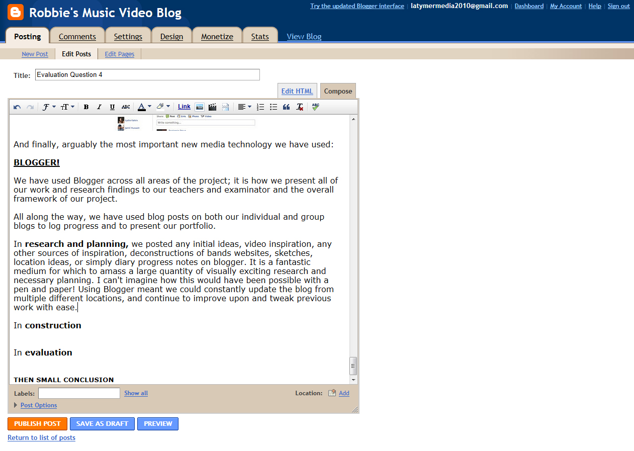
And finally, arguably the most important new media technology we have used:
BLOGGER!
We have used Blogger across all areas of the project; it is how we present all of our work and research findings to our teachers and examinator and the overall framework of our project.
All along the way, we have used blog posts on both our individual and group blogs to log progress and to present our portfolio.
In research and planning, we posted any initial ideas, video inspiration, any other sources of inspiration, deconstructions of bands websites, sketches, location ideas, or simply diary progress notes on blogger. It is a fantastic medium for which to amass a large quantity of visually exciting research and necessary planning. I can't imagine how this would have been possible with a pen and paper! Using Blogger meant we could constantly update the blog from multiple different locations, and continue to improve upon and tweak previous work with ease. Links to our teachers blogs also made finding extra resources and tips very easy.
In construction, blogger helped us reflect on shoots and project progress. We could post small memo's or reminders on to the blog for each other. The group blog is the way in which we present all our finished work as well, and Blogger lets us do this in a way which is accessible and aesthetically pleasing.
For the evaluation, blogger was how we presented our answers to the questions. Blogger is the staple of our whole portfolio!
Overall, new media technologies have been absolutely crucial to the success of our project. While, arguably, we could have pulled this off without any of these advancements; the quality of all areas of our project would have suffered dramatically.
New media technologies completely enveloped our project; very little of what we managed to achieve could have been made possible without the use of new technologies and advancements in Web 2.0.
Research and Planning
WEB 2.0
Before even proposing and song and video idea, we needed to gather information and inspiration from the huge array of videos now available online, through services such as YouTube and GoogleVideo.

VEVO: an example of a YouTube channel which offers hundreds of music videos
YouTube also has a feature which allows you to view the statistics of the video, detailing which age demographic has watched it the most, in which territories it is most popular, and also from where viewers had been directed to the video (Facebook, TV advert etc.)
This proved to be useful whilst examining a target audience in relation to genre. Finally, YouTube is a medium to share our finished videos, and receive feedback.
Facebook has proved to be an invaluable tool throughout the entire project, and is a massively upcoming social medium of the past few years. For research and planning purposes it made arranging group meetings and contacting actors very easy. We could also stay in regular contact online for small progress updates and detailing tasks which needed to be done. Also, researching in to already existing band's Facebook pages for inspiration was made easy.For construction, we have made a Facebook page for our band, which we then linked to our band website.
The new Google Maps Street View service allowed for easy location scouting. We would draw up a shortlist of locations for specific sections which needed shooting, then could narrow down the possibilities easily using Google Street View. This was wonderfully useful to our project: we travelled to many different locations to shoot and this saved lots of unnecessary journeys.
 |
| Google Street View |
Construction
Equipment
 |
| The Canon 550d, which we used to film our video |
Using new HD cameras was very beneficial to our project as we got to produce a film in fantastic quality; the camera's also allowed us to successfully capture our scenes with the UV lighting, which would have been near impossible with an inferior camera.
 |
| Capturing this footage would have been impossible without new media technologies at our disposal |
Premier Pro
This was the software we used to edit together our footage. It has been hugely useful to our project and has allowed to edit with complete precision.
It also let us do some clever effects with Eva, such as the shots where she dissapears.
Here is a screencap from Premier Pro:
We used Premier Pro to edit our track. The brief stated that our video must be 3 minutes or less, and our track selection was 4 minutes 30 seconds; even though Premier Pro is primarily for editing video, it worked brilliantly for cutting down and marginally speeding up our track, so it was under 3 minutes long.
We also used Premier Pro to create a promo montage-style video for the screening of all our music videos.
Photoshop
Photoshop was used heavily throughout the construction of our video, website and album cover. The album cover template itself was presented to us in a photoshop (.psd) format, making it the essential software to use for stills editing and graphics.
We created our main band logo on Photoshop:

After making this logo the blue and black colour scheme became consistent to our branding; as did the font of our name. The smokey effect round the letters was achieved through Photoshop and was also a motif we used across our album cover and website.
See here our album cover, which was entirely constructed in Photoshop.
We used Photoshop to edit promo pictures of the band, which were then used on our album cover and website. It helped us change the tints of pictures and put effects on them which suited our cold and metallic colour scheme.


The top shot is after the editing, the bottom is beforehand.
We used Photoshop to create a poster for an event with our band and another groups band together. We thought this was a good example of synergy, and could be made possible by Photoshop.

COLOUR
Colour was the software on the Mac which we used to colour grade our video.
Here is a short video, narrated by Eoin, which explains some of it's uses and applications with regards to our footage.
WEB 2.0
WIX.COM
Wix.com was the website we used to make our website. It is a flash based online website designer. We were the first year in our school to get to use this software, and it proved to be a fantastic way to integrate our website in with the rest of our project.
You can embed videos, pictures, hyperlinks and sound files in to your website through Wix, and it allows for high levels of visual customisation, with many buttons, effects and features available.
 |
| Wix's Interface is clean and well designed |
It allowed us to embed our music video on the 'Video' page of our website, as well as have our track selection playing when the user first arrives on the website.
The level of customisation available also allowed us to keep our branding consistent throughout all our texts. Starting with the original black and blue scheme on our album cover, we could use this throughout the website and also include smokey graphics and our band logo.
 |
| Our websites main page, which keeps in theme with our branding |
It also allows for high levels of audience interaction: pages can be commented on, you can enter a competition and sign up to our bands mailing list.
Simply having the ability to make a website at all (using Wix or not) greatly increases audience interaction with the band. As well as those ways already stated, users can view a whole array of photos from our band photo shoot, learn about and purchase tickets for upcoming gigs and view individual member bio's.
We also made a Twitter page for our band, which we then linked to our website.
Evaluation
I have already discussed how we used Web 2.0 in our evaluation; YouTube and Facebook for posting our video and receiving feedback; and the YouTube video statistics will prove interesting later on after some views have (hopefully) amassed, we will be able to see if our video is watched by the demographic for which it was intended.
Using Facebook, we also made an event for our screening, which helped to promote it.
And finally, arguably the most important new media technology we have used:
BLOGGER!
We have used Blogger across all areas of the project; it is how we present all of our work and research findings to our teachers and examinator and the overall framework of our project.
All along the way, we have used blog posts on both our individual and group blogs to log progress and to present our portfolio.
In research and planning, we posted any initial ideas, video inspiration, any other sources of inspiration, deconstructions of bands websites, sketches, location ideas, or simply diary progress notes on blogger. It is a fantastic medium for which to amass a large quantity of visually exciting research and necessary planning. I can't imagine how this would have been possible with a pen and paper! Using Blogger meant we could constantly update the blog from multiple different locations, and continue to improve upon and tweak previous work with ease. Links to our teachers blogs also made finding extra resources and tips very easy.
 |
| Posting on Blogger |
 |
| Blogger: displaying all our work on one web page |
For the evaluation, blogger was how we presented our answers to the questions. Blogger is the staple of our whole portfolio!
Overall, new media technologies have been absolutely crucial to the success of our project. While, arguably, we could have pulled this off without any of these advancements; the quality of all areas of our project would have suffered dramatically.
Subscribe to:
Posts (Atom)